|
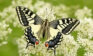
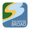
What is Salhouse Broad? Geographically it’s a large, freshwater lake approximately 20 acres in area and at its deepest 1.5m in depth. Biologically it’s an aquatic ecosystem, supporting a multitude of fish, invertebrates and insects, fringed by reedbed, fen and alder carr (wet woodland). Etymologically it is Old English for the shallow, reedy lake of the willow (or sallow) house (Salh-hūs Brad, literally sallow-house flat). Historically it’s a trade highway, bringing goods from the River Bure to the villages of Salhouse and Woodbastwick, with trading Wherries coming up the Wherry Cut and mooring at the staithe, near the current car park. But to most people, Salhouse Broad is something more personal: the place you remember feeding the ducks as a child, or paddling on the beach on a steamy summer’s day. The place you can’t wait to get to on your boating holiday, to feel the sense of peace and tranquillity. The place you watched the sunset across the water, with an ice cold gin and tonic in your hand. The place you saw herons, otters, grebes, kingfishers, dragonflies, butterflies, mallards and majestic swans. When something is so many things to so many people, how do you define it?  The swallowtail butterfly: a beautiful Norfolk species. The swallowtail butterfly: a beautiful Norfolk species. This was the challenge we were faced with when we decided to update our branding and logo. The current swallowtail design was looking tired and out of date, and wasn’t at all representative of any of the things Salhouse Broad is known for (it’s an overused trope of Broadland businesses and, although we occasionally get swallowtails at Salhouse, it’s by no means something we’re known for). With a new direction for the business we wanted to find something that represents us as eco-friendly, tranquil and a peaceful place for people to reconnect with nature, the outdoors, friends and family, all whilst recognising our rural and rustic heritage. We were amazed with the entries we received in our logo competition. The skill and originality of local artists was really a pleasant surprise. We had many different offerings, all made by people with an obvious connection and understanding of Salhouse Broad, and it was telling how many different interpretations of the place there could be. It was with great difficulty we narrowed down the entries to 4 finalists, and choosing an overall winner involved long and arduous discussions. But in the end everyone agreed the winner had earned it! Our new logo, designed by Bradwell based Daniel Morris (you can find him on Twitter, and Instagram) is dominated by the blue waters of the Broad itself, the thing that makes us what we are. Skilfully crafted out of the shallower water and the distinctive beach are the letters “SB”, with the green behind representing the grassy lawn and hill, the ideal place for summer picnics! Looking deeper, the “S” of the beach is also reminiscent of the meandering River Bure, reminding us we are just one part of a connected ecosystem. Or it could be a path, snaking its way down from the car park to the tranquillity of the Broad, the water of the Wherry Cut on one side, the green of the ancient oaks and meadows on the other. Finally, the waist of the “B” gives us the beak of a water-bird, a grebe or cormorant perhaps, using Salhouse Broad as a place to live, hunt, mate, and raise its young. We’re well aware not everyone will like our new logo. Change takes time to get used to, and we’ve had the swallowtail since our inception back in 2003. But Salhouse Broad has the potential to offer some really wonderful things, which benefit the environment, local people, and our visitors. By looking forward, giving ourselves a fresh new identity, and distinctive branding, we can make sure Salhouse Broad continues to be a place for people to make memories, spend time with their families, and basking in the wonderful surroundings.
3 Comments
Steve Piper
19/2/2019 07:12:39 pm
That is a brilliant logo.
Reply
Leave a Reply. |
